
Design & Identity
Here are a selection of some of our favorite identities, logos and word marks.


IBM
Our first love was graphic design and so we were honored to have been instrumental in bringing this logo into being.
A symbol that announced IBM’s break with the past and a commitment to a new age. A testament to the fact e-business is now known as simply ‘business’.
The longer story is here

Wellworth
A re-name and rebrand for a bespoke healthcare service. The word mark combining the Ws of the name to make a pulse, the ‘heart’ of the enterprise, if you will. find them here

the UN
A little negative space action removing the M
(that’s the mines btw) from the acronym for the United Nations Mine Action Service .
A Logo redesign to go with a design system for the agency.
And a spot we concepted and made here
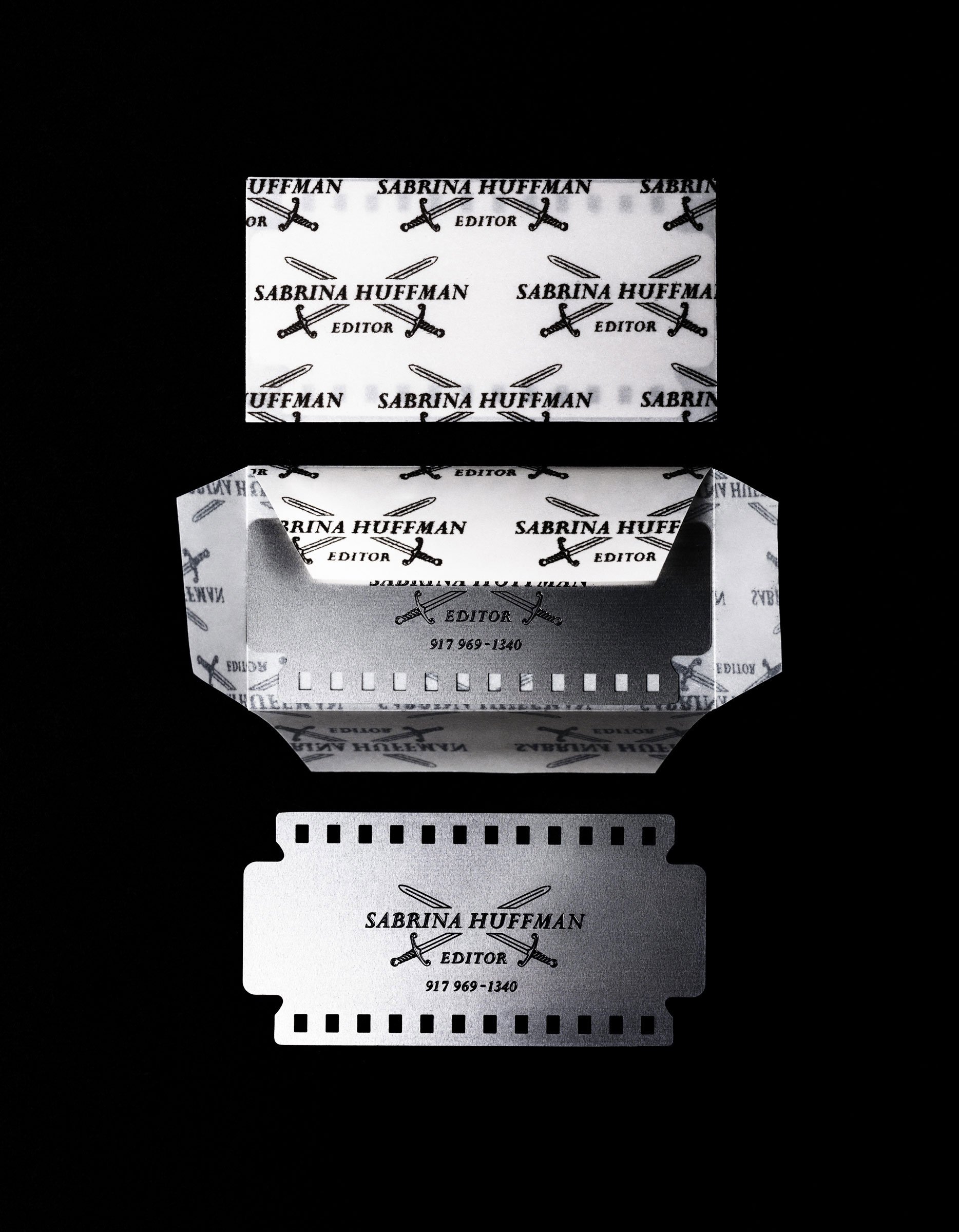
‘Razor’ business card
Revisiting the pre-digital age when editors were fondly referred to as “cutters” we found the perfect retro way to convey the precision of the craft: A thin stainless steelblade/filmstrip hybrid.
It duly helped her cut through the clutter.
And win a few awards!

Dirty rice
Independent film production company dirty rice entrusted us with their identity design. As part of the project each partners business card was a mini ‘screenplay’ echoing their personality.
Yet another award winner. Yay.

Trusthouse
We helped rename and rebrand this company that provides specialized nurses to help people stay in their own homes.
Find them here